
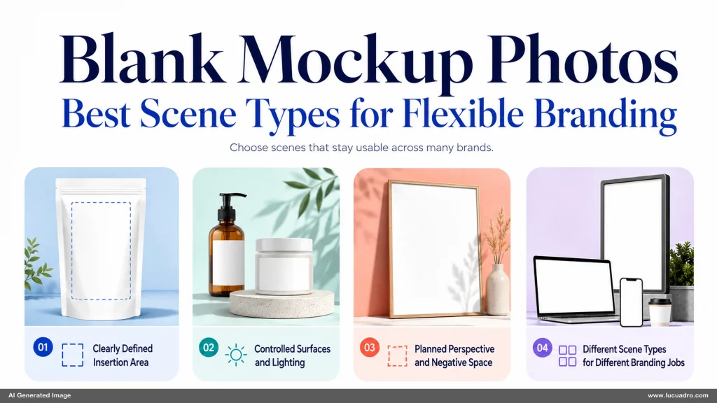
Blank Mockup Photos: The Best Types of Scenes for Flexible Branding are most useful when the scene gives you room to change the brand without fighting the photograph. A polished mockup can still be restrictive if the surface is too small, the perspective is awkward, or props crowd the insertion area. The strongest scenes are designed around usable space, believable surfaces, and composition choices that remain flexible after the original shoot.
Blank Mockup Photos With Space for Branding Need a Clearly Defined Insertion Area
The most important feature in blank mockup photos with space for branding is not decoration. It is a surface that clearly tells you where the brand belongs. A blank package front, framed print, tablet screen, sign, label, or poster should be large enough to carry real artwork without forcing extreme scaling. The edges should be visible, the surface should not be blocked by props, and the camera angle should make the insertion area easy to understand at a glance.
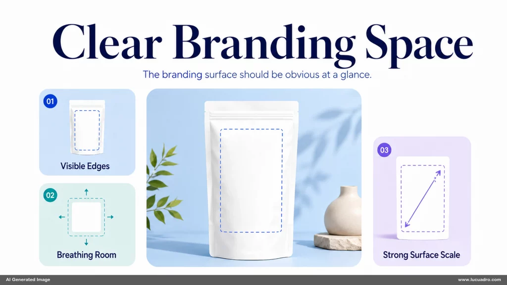
A useful insertion area also needs visual breathing room around it. If a ceramic bottle is surrounded by flowers, ribbons, shadows, and overlapping objects, the mockup may look finished before you place anything on it. That limits how many brands can fit naturally. A cleaner composition gives you more control over hierarchy. You can add a bold logo, a quiet label, or a detailed illustration without competing with a scene that already demands too much attention.
Scale matters as much as clarity. A branding surface that occupies a tiny fraction of the frame may be technically usable but weak in practice. For a bakery packaging campaign, the front panel of the box should remain readable enough to carry a mark, product name, or graphic treatment without becoming a minor detail. The best mockup scenes make the branded surface one of the main visual anchors while leaving enough environment to give the object context.
Product Mockup Scenes for Flexible Brand Design Work Best With Controlled Surfaces and Lighting
Product mockup scenes for flexible brand design depend on surfaces that react predictably to artwork. Matte paper, coated packaging, brushed metal, glass, fabric, and digital screens each require different treatment. A flat paper label accepts artwork differently from a curved bottle. A glossy screen needs believable reflections. A folded fabric item needs artwork that follows the material. The photograph should make those physical properties visible without allowing glare, texture, or shadow to obscure the area where branding will be placed.
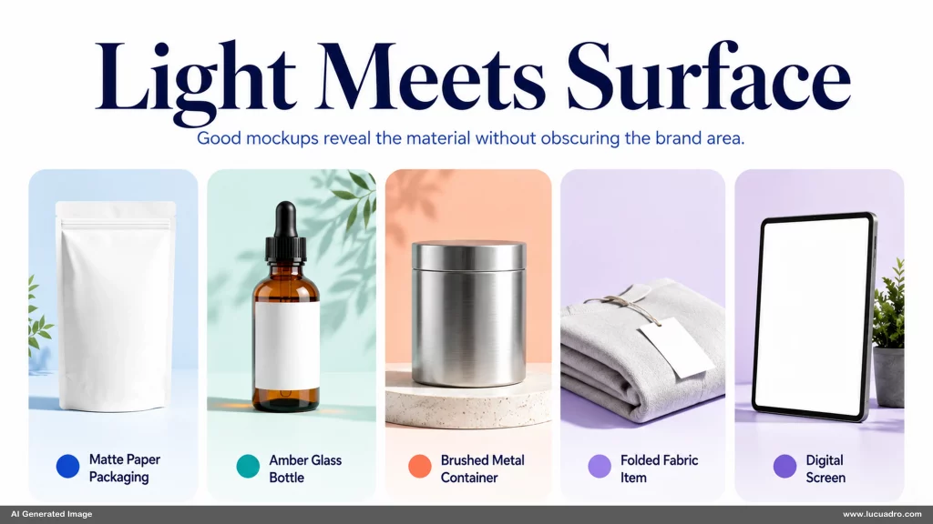
Lighting controls whether the inserted artwork feels native to the scene. Hard highlights across the center of a label can make a logo difficult to read. Heavy shadows can make a flat graphic feel pasted on when the underlying surface is not visible. Controlled directional light is usually more flexible because it establishes form while preserving usable tonal range. You can still retain realism, but the lighting should support later compositing instead of turning the blank surface into the most complicated part of the image.
The surrounding props should support the scene rather than define the brand for you. A machine-tool product launch might benefit from a precise industrial work surface and a few restrained technical objects, but not from a fully branded environment that dictates color, tone, and audience before the product artwork is added.
High Resolution Mockup Backgrounds Become More Flexible When Perspective and Negative Space Are Planned
High resolution mockup backgrounds for professional branding need more than extra pixels. The perspective should match the way the object or surface is likely to be used. A front-facing poster frame works well for artwork that must remain rectangular. A slightly angled package can feel more natural for product photography, but the angle should still leave enough visible surface for the artwork to read clearly. Perspective becomes a design constraint the moment you place content into the scene.
Negative space increases the number of layouts a mockup can support. A clean area beside a product can hold a headline, price, feature list, or supporting graphic without forcing you to crop the object aggressively. The location of that space matters. A left-side opening supports one type of composition, while a right-side opening supports another. A useful library should include both so the same visual style can support different content hierarchies without rebuilding the scene.
The Best Mockup Library Includes Different Scene Types, Not Endless Variations of One Setup
A flexible mockup library gains more from distinct scene types than from dozens of near-identical variations. Packaging scenes answer one need. Digital screens, framed prints, tabletop objects, signage, stationery, and presentation materials answer others. Each type creates a different branding surface and a different relationship between the inserted artwork and its environment. A collection becomes more useful when it covers these different visual jobs while keeping lighting, quality, and overall art direction compatible.
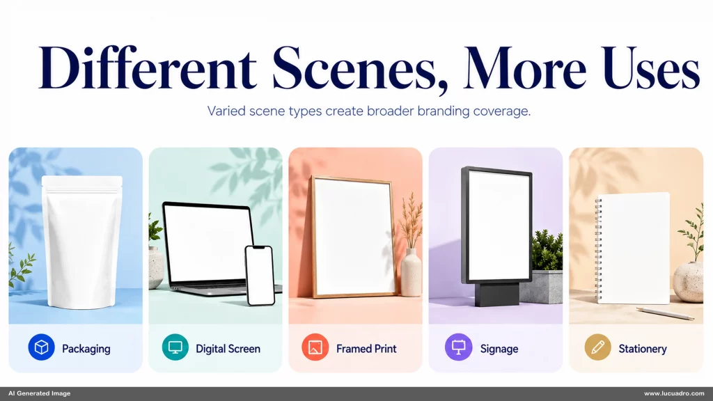
Variation within a scene type still matters, but it should solve a real placement problem. A second package angle may expose a side panel. A wider framed-print scene may create room for copy. A close digital-screen view may help interface details read more clearly. These variations add value because they change what the mockup can do. Repeating the same object at slightly different distances may increase file count without increasing the number of useful branding situations.
Blank Mockup Photos: The Best Types of Scenes for Flexible Branding work best when every scene preserves room for later decisions. Clear insertion surfaces, controlled light, planned perspective, and varied scene types make a mockup collection easier to direct across different projects. A Lucuadro visual asset library follows the same principle of keeping the composition useful before the final brand is applied.