

Visual Metaphors for Business become useful when a concept cannot be understood by looking at the words alone. Business language is full of invisible forces: growth, friction, risk, alignment, dependency, opportunity cost, momentum, and change. A slide can name those ideas accurately and still leave the audience with nothing concrete to picture. The communication problem is not lack of information. It is the absence of a visible structure that makes the relationship easy to grasp.
Literal illustration often solves the wrong problem. A photograph of a team can suggest teamwork, but it does not show what coordination means in the argument you are making. A rocket can imply growth, but it says nothing about whether growth comes from compounding, scale, acceleration, or added capacity. The image is recognizable, yet the logic remains hidden. That is why decorative business imagery often feels polished while adding almost no explanatory value.
A strong metaphor begins with the relationship inside the idea. You identify what changes, what depends on what, where pressure accumulates, what becomes constrained, or what moves from one state to another. Once that relationship is clear, the visual can be simple. The audience does not need to admire the object. It needs to see the structure and transfer that structure back to the business idea without extra explanation.
Visual storytelling structures for abstract business ideas show relationships, not objects

Visual storytelling structures for abstract business ideas work best when the arrangement carries the meaning. Two objects can communicate opposition because of distance, balance, or collision. A sequence can communicate progress because one state visibly becomes another. A narrow passage can communicate constraint because many inputs are forced through one limited opening. The same objects arranged differently can tell a completely different story, which is why composition matters more than the symbolic object you start with.
This is also why familiar metaphors need more judgment than they appear to require. A staircase, bridge, funnel, maze, iceberg, or domino chain can be useful, but only if its physical logic matches the concept. If every problem becomes a mountain and every strategy becomes a road, the metaphor stops clarifying anything. The goal is to preserve one important relationship from the business idea and express it with as little visual noise as possible.
The strongest examples also survive removal of labels. If the image still communicates pressure, sequence, dependency, imbalance, or choice when the text disappears, the visual is doing real work. That standard connects directly to visual storytelling for business: the audience should be able to infer the intended relationship from placement, scale, direction, contrast, and sequence before reading the supporting copy.
A useful counterexample is the icon substitution habit. Replacing the word strategy with a compass, innovation with a bulb, or teamwork with linked hands creates recognition without explanation. The audience identifies the category but learns nothing about the particular claim. A metaphor earns its place when its internal structure matches the logic you are arguing. The more abstract the business term, the more important it becomes to ask what relationship the visual must make visible rather than which object commonly represents the word.
Visual metaphors for business presentations: growth, progress, and momentum

1. Staircase. A staircase makes staged progress visible because each level depends on reaching the one below it. Use it when growth comes through capability, maturity, certification, product stages, or sequential milestones. The metaphor becomes weaker when the real process is continuous rather than stepped. Keep the number of steps low enough that the audience sees progression first and labels second. A missing or broken step can also show why one unresolved stage blocks movement to the next.
2. Snowball. A snowball communicates compounding because its future size depends on what it has already accumulated. It fits recurring revenue, knowledge accumulation, audience growth, data advantage, referrals, or repeated process improvement. The visual should show a clear increase in mass across distance rather than a cartoon snow scene. A small starting object followed by visibly larger states lets the viewer understand that later gains are produced partly by earlier gains, not only by fresh effort.
3. Flywheel. A flywheel shows momentum created by a reinforcing loop. It works when one activity strengthens another and the combined effect makes the next cycle easier or more productive. The important feature is not the wheel itself but the circular transfer of force. Show a few distinct inputs feeding a common rotational system and a visible sense of stored motion. Avoid filling the circle with many labels, because the metaphor loses force when it starts looking like a dense process diagram.
4. Runway. A runway turns time and remaining capacity into physical distance. It suits cash runway, product launch readiness, hiring capacity, or any situation where resources must last until a destination is reached. The end point should be visible but not yet reached, while the remaining distance carries the tension. This metaphor is especially useful when the core question is not how fast something is growing, but whether enough room remains to complete the next critical move.
5. Expanding circles. Expanding circles show reach that grows outward from a source. They fit distribution, influence, market penetration, capability diffusion, or the spread of a new standard across an organization. The center should represent the origin and the outer rings should show increasing scope without becoming a generic target symbol. Variation in ring thickness or spacing can signal uneven expansion. The key relationship is simple: one source affects a progressively larger area while retaining a clear point of origin.
Friction, bottlenecks, and constraints become visible when flow is interrupted

6. Narrow pipe. A wide stream forced through a narrow pipe makes a bottleneck immediately visible. Use it when demand, work, information, approvals, production, or customer requests exceed the capacity of one stage. The metaphor works because the input and output can be shown at the same time, making the restriction obvious. Do not hide the bottleneck in a complicated system. Make the narrow point the dominant feature and let the audience see that additional upstream effort cannot solve a downstream capacity limit.
7. Traffic merge. A traffic merge shows friction created when several flows compete for one shared path. It fits cross functional handoffs, approval queues, competing priorities, limited specialist capacity, or shared infrastructure. The image should make convergence more important than the vehicles themselves. Several orderly lanes becoming one constrained lane communicates why delay increases even when each source performs well individually. This is useful when the problem is not a broken process, but too many valid processes demanding the same scarce resource.
8. Sand in gears. Sand in gears represents small sources of friction that reduce the performance of an otherwise functional system. It suits poor data quality, repeated rework, unclear handoffs, small policy obstacles, or accumulated administrative drag. The gears should still appear mechanically sound, because the point is that the system is capable but impaired. A few visible grains at contact points are more effective than dramatic damage. The viewer should understand that removing friction may improve output without rebuilding the whole machine.
9. Dam and reservoir. A dam shows pressure accumulating because flow is held back. It works for approval delays, inventory buildup, unresolved decisions, customer backlog, or information waiting behind a gatekeeper. The visual needs a clear contrast between the full side and the released side. A small opening can indicate controlled throughput, while a completely sealed barrier suggests a hard stop. The metaphor is strongest when you want to show that the visible delay is only one consequence and that pressure is building somewhere upstream.
10. Weighted sled. A weighted sled shows how extra burden slows forward movement without changing the destination. It fits technical debt, policy overhead, legacy processes, maintenance burden, or organizational complexity. The person or machine pulling the sled is less important than the contrast between forward force and resisting mass. Add only a few distinct weights so the visual reads immediately. This metaphor helps separate lack of effort from structural drag, which is often the more useful diagnosis in business discussions.
Choice, tradeoffs, and strategic direction need visible exclusion
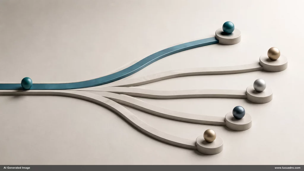
11. Forked road. A forked road works when choosing one direction means not taking another. It fits strategic priorities, market selection, product focus, investment allocation, or positioning decisions. The image should show divergence clearly and avoid implying that the paths easily reconnect later. Different terrain or distance can signal different risk profiles without adding labels. The useful idea is exclusion: strategy becomes visible when the audience can see that resources committed to one route are no longer available to travel the other.
12. Balance scale. A balance scale expresses tradeoffs when improving one side changes the state of another. It fits speed versus quality, efficiency versus resilience, customization versus standardization, or short term return versus long term capability. The scale should not always be perfectly balanced, because many decisions intentionally favor one side. The metaphor becomes more informative when the chosen imbalance is visible. That makes it possible to discuss what the organization is optimizing for rather than treating every tradeoff as a problem to eliminate.
13. Limited shelf space. A fixed shelf with more objects than available space shows prioritization under capacity constraints. It works for product portfolios, roadmaps, campaign slots, management attention, or project selection. The shelf should be visibly finite, while several credible candidates remain outside it. That prevents the metaphor from becoming a simple ranking. The point is that some worthwhile options still cannot fit. This makes opportunity cost tangible because inclusion and exclusion are visible in the same frame.
14. Spotlight. A spotlight represents focus because only a limited area can receive full attention at one time. It suits strategic concentration, executive attention, brand positioning, or the choice to emphasize one customer problem. The strongest composition keeps most of the frame deliberately quiet while one area receives clear illumination. Several competing objects can sit outside the beam without looking unimportant. They are simply not the current focus, which is often a more accurate way to communicate prioritization than marking everything else as low value.
15. Bridge with weight limit. A bridge with a visible load limit shows that a path may exist but cannot carry unlimited demand. It fits scaling decisions, system capacity, partnership dependence, or plans that rely on fragile infrastructure. The audience should see both the destination and the constraint before the crossing is attempted. This metaphor is useful because it prevents a false binary between possible and impossible. The route can be viable at one scale and fail at another, which is a common strategic distinction.
Systems, hierarchy, and interdependence become clearer through structure
16. Foundation and floors. A building foundation shows dependency between basic capability and higher level outcomes. It fits data quality beneath analytics, process discipline beneath automation, operating systems beneath scale, or trust beneath collaboration. The upper floors should look credible but visibly dependent on what supports them. A crack at the base can show why problems appear far from their source. This is stronger than a generic hierarchy pyramid when you need to emphasize that higher layers cannot remain stable if foundational conditions fail.
17. Chain links. A chain expresses interdependence because overall strength depends on connected parts rather than the best individual part. It suits supply chains, multi stage processes, partner networks, security controls, or service delivery. One weakened link should be visually obvious without making the image melodramatic. The chain metaphor is most useful when the audience tends to evaluate components independently. It redirects attention toward continuity, showing that one failure can interrupt the whole system even when every other element performs well.
18. Orchestra. An orchestra represents coordinated specialization. It fits organizations where many skilled contributors create value only when timing, roles, and shared direction align. The conductor can be present, but the metaphor should not reduce coordination to top down control. Section placement, timing, and different instruments can show that contribution is distributed. The image works best when the business point is about synchronized difference: the system succeeds because parts remain distinct while following a common structure and responding to one another.
19. Modular blocks. Modular blocks show composability, reuse, and system design. They fit product architecture, reusable content, operating modules, design systems, or capabilities that can be rearranged into different outputs. The blocks should have compatible interfaces while remaining visibly distinct. Several valid arrangements can be shown without presenting a finished locked template. This makes the metaphor especially useful when the argument is that flexibility comes from standardized building parts rather than from starting from scratch every time.
20. Irrigation network. An irrigation network shows how value or resources travel through a system and where distribution becomes uneven. It fits information flow, budget allocation, lead distribution, training reach, or support capacity. A central source feeding branches makes dependency visible, while dry or oversupplied areas show imbalance. The image should let the viewer trace flow from origin to outcome. This is more informative than a generic network graphic when the question is not connection alone, but how much reaches each destination.
Complex systems often tempt designers toward diagrams with every component shown. That can be appropriate when the task is documentation, but it is different from explanation. A metaphor deliberately leaves detail out so one relationship becomes easier to see. Foundation, chain, orchestra, modular blocks, and irrigation network each simplify a system in a different way. Choosing among them depends on whether the argument is about dependency, continuity, coordination, recombination, or distribution. The metaphor is a lens, not a complete model.
Risk, uncertainty, and change become easier to see when stability has conditions

21. Cracked ice. Cracked ice communicates hidden fragility beneath a surface that still appears usable. It fits concentration risk, thin safety margins, dependency on one supplier, weak cash reserves, or systems that perform normally until a threshold is crossed. The crack should be visible before total failure occurs. That timing matters. The metaphor is about exposure, not catastrophe. It helps an audience see why current performance can coexist with serious risk and why waiting for visible failure is often too late.
22. Foggy path. A path disappearing into fog represents uncertainty without implying that no direction exists. It fits forecasting, market entry, long projects, research, or decisions where the next move is clearer than the final destination. Keep the near section of the path visible and the distance obscured. This makes staged decision making intuitive: act on what is known now, then update as more becomes visible. The metaphor avoids pretending that uncertainty can be removed before action, while still preserving a sense of direction.
23. Jenga tower. A block tower shows systems that remain standing while safety margins are gradually removed. It fits cost cutting, accumulated shortcuts, staff reduction, technical debt, or repeated exceptions to controls. The important feature is the growing imbalance, not the eventual collapse. Several missing blocks can make the audience feel that each individual removal looked harmless in isolation. This metaphor is especially useful when risk is created by many small decisions whose combined effect is more important than any single decision.
24. Tide line. A rising tide line shows external change that alters the usable space around a business. It fits regulation, cost inflation, changing customer expectations, technology shifts, or any environmental force that moves the boundary of what remains viable. The business object in the scene can stay still while the surrounding condition changes. That distinction is valuable because it shows that risk can increase without internal deterioration. Sometimes the organization is unchanged while the environment makes the old position less safe.
25. Moving target. A moving target represents goals whose definition changes while work is underway. It fits shifting requirements, rapidly changing markets, evolving customer expectations, or projects with unstable success criteria. The target should visibly move across several positions while the effort follows behind. This is more precise than using a target icon for every goal. The metaphor is about instability in the objective itself, which helps explain why better execution alone may not improve results when the destination keeps changing.
Composition rules that make business visuals look premium
Composition rules that make business visuals look premium begin with reduction. Choose one relationship and make it dominant. If the point is bottleneck, the eye should land on the narrow passage before anything else. If the point is tradeoff, the viewer should see the competing sides before reading labels. Scale, spacing, direction, contrast, and negative space are not finishing touches. They are the mechanism that tells the audience where meaning sits and what order to read it in.
A metaphor also needs the right degree of specificity. Too generic and the visual becomes stock imagery with a new caption. Too literal and the image starts explaining the example instead of the principle. A useful middle ground keeps the physical logic unmistakable while removing details that do not carry meaning. A bakery campaign may use a limited shelf to show channel allocation. A safety training deck may use a weakened chain to show procedural dependency. The object changes, but the relationship remains legible.
Consistency across a deck or campaign does not mean repeating the same metaphor. It means keeping a coherent visual language while selecting different structures for different claims. Similar light, palette, framing, and material treatment can make a staircase, narrow pipe, chain, and foggy path feel like one family. The concepts stay distinct while the art direction stays controlled. That balance gives you range without the visual randomness that appears when every slide is built from an unrelated stock image or a separate generative style.
The final test is whether the visual compresses explanation. Visual Metaphors for Business should reduce the number of words required to make a relationship understandable, not add a decorative layer beside the same paragraph. When you build with modular components, business diagram templates, or Lucuadro premium design assets, the value comes from arranging the parts so the structure carries the idea. The metaphor succeeds when the audience can see the business logic before you finish explaining it.