
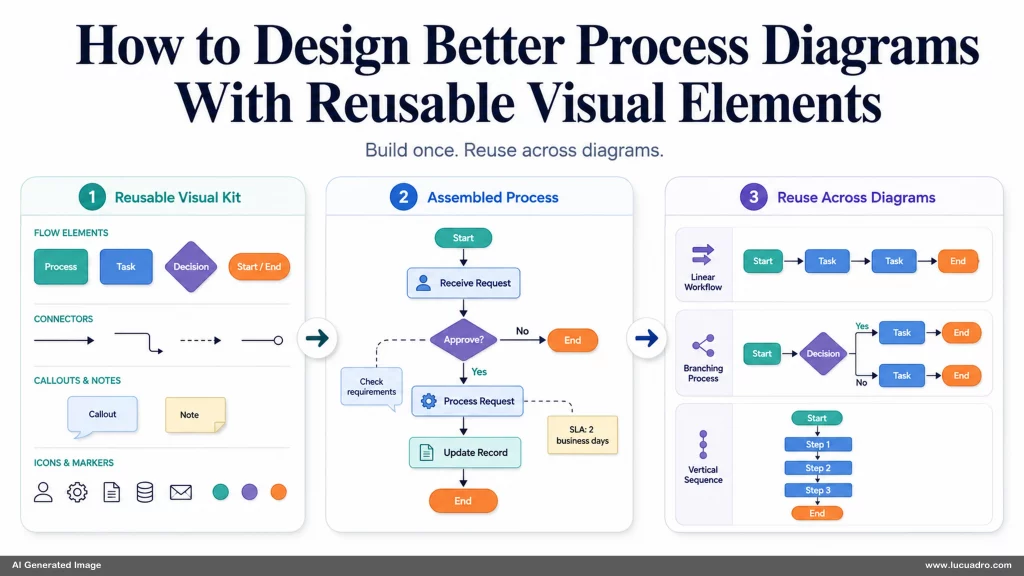
How to Design Better Process Diagrams With Reusable Visual Elements starts with a practical problem: most process graphics are built as one-off arrangements. You create boxes, arrows, labels, icons, and backgrounds for one slide, then repeat the same work when the next process changes. Transparent background design elements and layered design assets can reduce that repetition, but only when the diagram is treated as a reusable visual system rather than a finished picture.
Better Process Diagrams Start With a Reusable Visual Vocabulary
A clear process diagram depends on a small visual vocabulary that repeats consistently. Step containers should share a shape family. Connectors should behave the same way from one stage to the next. Icons should carry the same weight and level of detail. When every component follows a different visual rule, the reader spends attention decoding the design instead of following the process. Reuse begins by deciding which parts deserve a stable visual language before you start arranging the specific sequence.
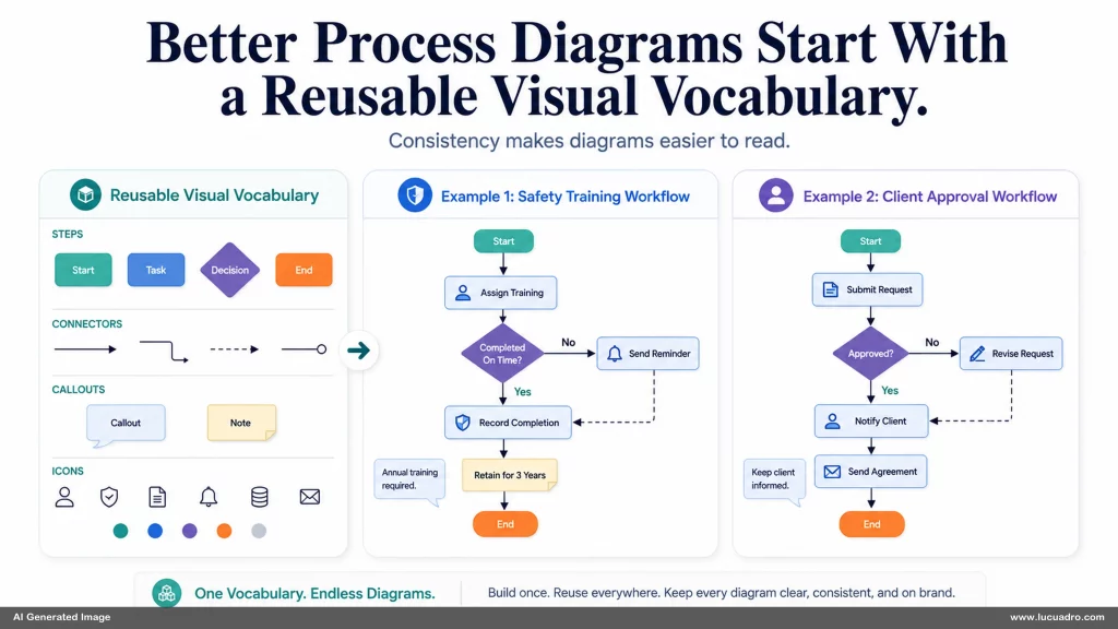
This does not mean every process must look identical. A five-step safety training workflow and a client approval sequence can use the same container shapes, connector treatment, icon style, and spacing logic while still producing different compositions. The value sits in preserving the visual grammar while changing the content. Once the core elements are consistent, you can rearrange them without forcing the reader to relearn how the diagram works each time.
A reusable vocabulary also gives you a faster starting point. Instead of opening a blank slide and rebuilding the same visual parts, you begin with a small kit of tested components: primary steps, secondary steps, decision points, connectors, callouts, and supporting symbols. The kit should be broad enough to cover the processes you actually communicate, but restrained enough that every element still feels related.
Transparent Background Design Elements Make Diagram Components Easier to Recombine
Transparent background design elements for presentations and documents become especially useful when a process has to move between formats. An isolated icon, arrow, marker, or decorative effect can sit on a light slide, a dark workshop board, or a branded document without carrying a fixed rectangle behind it. The element remains portable. That portability matters because process diagrams often change context even when the underlying logic stays the same.
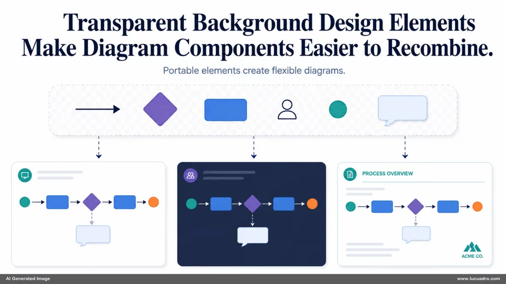
Separating useful parts also prevents one visual decision from locking the others. If an arrow is baked into a background image, changing the direction may require rebuilding the complete graphic. If the arrow, step container, icon, and background remain independent, you can change one without disturbing the rest. A clinic onboarding flow can gain another approval stage, or a training sequence can change order, without forcing the entire visual to be regenerated from scratch.
Useful reuse depends on clean edges, sufficient resolution, and predictable proportions. A component that technically has transparency but carries poor antialiasing, inconsistent padding, or an awkward crop creates extra cleanup every time it is placed. Reusable elements should feel ready for composition. Their value comes from being easy to position, scale, layer, and combine with other assets while preserving visual quality.
Composition Rules That Make Business Visuals Look Premium Also Improve Process Flow
Composition rules that make business visuals look premium also make process diagrams easier to understand. Spacing establishes which steps belong together. Alignment creates a visible path. Negative space separates major phases so the eye can pause before moving on. These choices are functional, not decorative. When the arrangement is crowded or the hierarchy changes unpredictably, even a logically correct process can feel difficult to follow.
Directional rhythm matters as well. A process that reads left to right should not suddenly force the eye downward and then back across the page without a clear reason. Connector lengths, turn angles, and stage spacing should support the sequence. A good diagram often feels simple because the composition removes unnecessary decisions from the viewer. The reader can see where to begin, what comes next, and which branch deserves attention without searching the page.
Reusable components make those composition rules easier to maintain. If your step blocks already share dimensions, your connectors already match, and your callouts follow one hierarchy, the diagram begins with structural discipline built in. You can still break the pattern when the content requires emphasis, but the exception becomes visible because the rest of the system is consistent. That gives important stages more weight without adding ornamental complexity.
Layered Design Assets You Can Combine Into Your Own Compositions Turn One Diagram Into a Reusable System
Layered design assets you can combine into your own compositions change the useful lifespan of a process diagram. Instead of storing one finished slide, you preserve the components that made it work: backgrounds, step blocks, connectors, icons, markers, effects, and alternate layout pieces. The next diagram can borrow the parts without copying the previous arrangement. This is where a one-off graphic becomes a practical design resource.
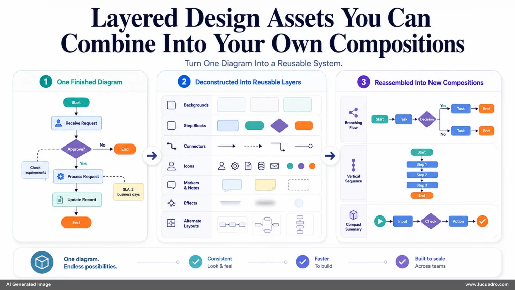
The strongest systems grow through actual use. When a new project needs a branching connector, a vertical step variant, or a compact decision marker, you add that component back to the shared set. Over time the kit becomes better matched to the real processes you communicate. You spend less time rebuilding familiar visual mechanics and more time deciding how the specific process should be framed, ordered, and emphasized.
How to Design Better Process Diagrams With Reusable Visual Elements ultimately comes down to keeping useful decisions available for reuse. A stable visual vocabulary, transparent components, and disciplined composition make each new diagram easier to assemble without forcing it into a fixed template. Lucuadro design resources follow the same principle of preserving creative control.