
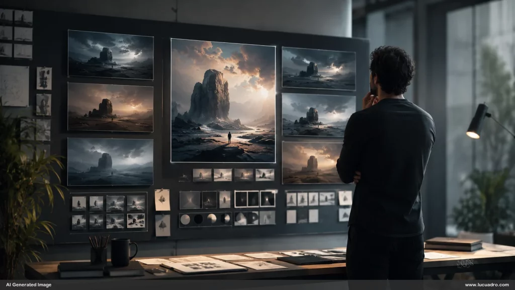
AI art direction becomes necessary the moment image generation stops being the hard part. You can produce polished visuals quickly, yet still end up with a set that feels unfocused, inconsistent, or difficult to use. The missing decisions are rarely about adding more prompt detail. They concern what the viewer notices first, how the frame carries the message, which visual choices repeat, and which outputs are rejected before they ever reach the final composition.
Prompt engineering for images cannot decide what deserves emphasis
Prompt engineering for images can describe subject matter, materials, mood, and even camera language, but description does not automatically create emphasis. A prompt may ask for a premium office, a confident presenter, soft side light, and a wide composition. The resulting image can satisfy every instruction and still bury the presenter against an equally strong background. Art direction decides that the presenter must dominate, the background must recede, and the empty side of the frame must remain usable for the message.
That distinction matters because professional visuals are judged as compositions, not as compliance reports. A technically correct image can still fail when the eye has no clear path through it. Before generation, define the focal subject, the secondary support, and the area that must remain quiet. Decide whether the image needs tension or calm, intimacy or distance, symmetry or directional movement. Those choices tell you what the image is for, which is a different question from what the image contains.
Visual hierarchy also depends on what you refuse to emphasize. If every surface glows, every object carries detail, and every region receives equal contrast, the image has no meaningful center. Professional direction often means removing visual competition. You may simplify the background, reduce color variation, push a secondary object farther from the focal area, or leave a deliberate patch of quiet space. These are small decisions, but they are the ones that make a generated image useful inside a larger composition rather than merely impressive on its own.
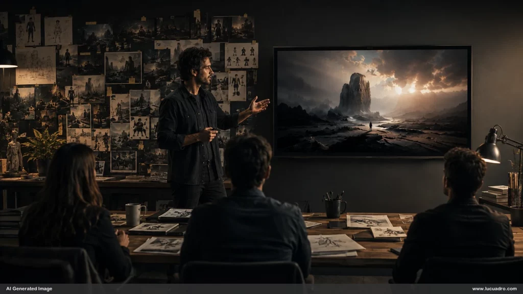
Composition rules that make business visuals look premium start before generation
Composition rules that make business visuals look premium begin before you ask for an output. Framing determines how much context surrounds the subject. Lighting determines which surfaces advance and which recede. Negative space determines whether the visual can support a headline, label, or interface later. Contrast determines what survives when the image is reduced inside a slide or card. If these decisions are left to chance, you may get a beautiful image that becomes awkward the moment it enters a real layout.
The practical shift is to define constraints that serve the final use. A presentation cover may need a strong subject on one side and a calm field on the other. A product launch page may need a centered object with enough surrounding space to survive responsive crops. A sequence of social visuals may need the same light quality and material treatment across several compositions. Art direction converts these needs into visual rules before you generate, so evaluation becomes faster and more consistent afterward.
Lighting deserves particular attention because it can quietly reset the entire visual language. Two images can share the same subject, palette, and framing but still feel unrelated if one uses flat frontal light and the other uses hard directional contrast. Decide what the light is doing before you judge detail. Is it separating the subject from the background, revealing material, creating depth, or directing the eye? Once that role is fixed, lighting becomes a continuity device rather than a decorative effect that changes from image to image.
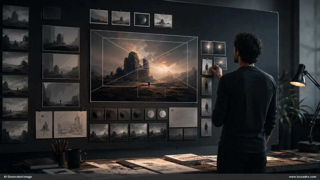
Reference images for AI image generation reduce visual ambiguity
Reference images for AI image generation reduce ambiguity because they carry decisions that text must otherwise approximate. A strong reference can lock the relationship between subject and background, the character of a material, the density of detail, the apparent lens distance, or the way light falls across a scene. The point is not to copy a finished image. The point is to preserve the parts of the visual language that should remain stable while allowing controlled changes in subject, crop, or scenario. This is why reference images for AI image generation are increasingly useful as working infrastructure.
This also changes how you write prompts. Instead of forcing every visual decision into a long block of text, you can separate invariants from variables. The reference carries the stable visual logic. The prompt specifies what changes. That division is easier to control because you stop asking language to recreate every subtle spatial relationship from scratch. A good reference becomes a compressed set of design decisions, which is why a consistent reference system can outperform increasingly elaborate prompt wording.
Sequence and selection turn isolated images into a usable visual system
Sequence and selection turn isolated images into a usable visual system because the strongest individual output is not always the strongest member of a set. One image may look impressive on its own but break the pacing of a presentation, shift the palette, introduce a different camera language, or pull attention away from the surrounding material. Art direction continues after generation by comparing outputs against the role each image must play and removing anything that weakens the larger visual structure.
Selection is where abundance becomes useful instead of distracting. When you generate many options, you need criteria that are stricter than whether an image looks good. Ask whether the focal point is clear, whether the composition survives at the intended size, whether the palette belongs with the surrounding work, whether the image leaves the necessary functional space, and whether it contributes something distinct to the sequence. Rejection is part of the craft. Keeping fewer images can create more creative range when the remaining set is coherent.
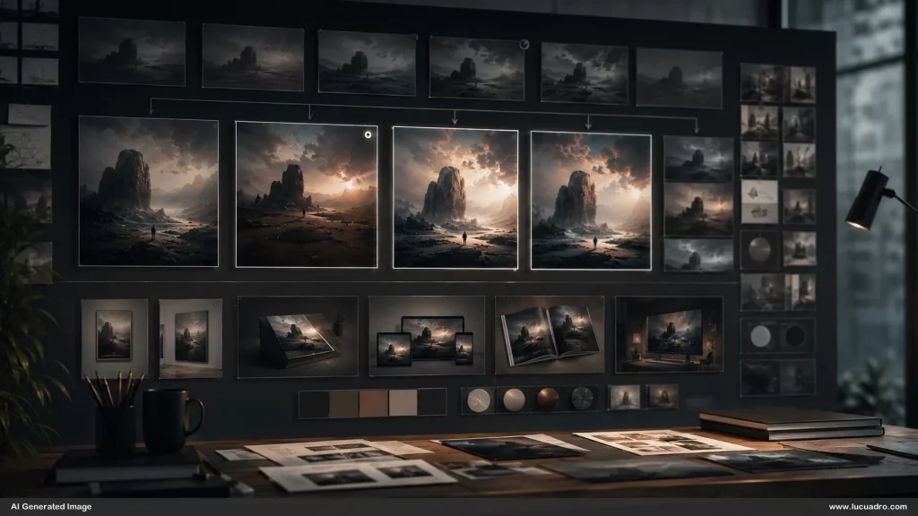
AI art direction turns generation into a professional visual workflow because it gives every image a role before you judge its surface polish. Framing, lighting, hierarchy, references, sequence, and selection become connected decisions rather than separate corrections. That is the difference between producing attractive outputs and building material that can be reused with confidence. The broader case for art direction and AI image generation follows the same principle, and Lucuadro design resources are built for that kind of compositional control.