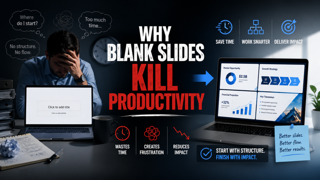
Few things slow down presentation creation more than a blank slide. At first glance, an empty canvas appears to offer unlimited flexibility. In practice, it creates unlimited decisions. Every new page requires choices about layout, hierarchy, structure, imagery, spacing, and flow. Before the message can be communicated, the creator must first solve a design problem. This hidden workload quietly reduces productivity across almost every presentation project.
A blank slide creates too many choices
Most people assume freedom increases efficiency. In presentation design, the opposite is often true. A completely empty slide forces the creator to make dozens of decisions before meaningful work can begin. Where should the title go? How much space should the visual occupy? Should the content be arranged vertically, horizontally, or in a grid?
None of these questions directly improve the quality of the message. Yet they consume time and attention. The result is a workflow where progress feels slower than expected even when the content itself is already available.
Decision overload interrupts creative momentum
Creating a presentation requires both thinking and execution. When too many design decisions appear at the same time, momentum begins to break down. Instead of focusing on the argument, the creator starts evaluating layout possibilities, visual arrangements, and formatting options.
This constant switching between communication and design creates cognitive friction. Each interruption slows progress. Over the course of an entire presentation, these small delays accumulate into hours of additional work. What should have been a content task becomes a design task.
Wireframe slide layouts remove unnecessary complexity
Professional presentation teams often avoid blank slides entirely. They begin with wireframe slide layouts that already establish structure, hierarchy, and content zones. Rather than asking where information should go, they focus on what information belongs on the page.
This approach dramatically simplifies the workflow. A comparison slide already has a comparison structure. A process slide already has a process structure. A framework slide already has a framework structure.
Layout libraries create a faster presentation design workflow
A strong presentation design workflow depends on reducing repetitive decisions. Layout libraries accomplish this by providing pre-built communication frameworks that can be reused across different projects.
Instead of building every slide from zero, you select an appropriate structure and adapt it to the topic. This creates consistency while reducing production time. Workshop decks, sales presentations, strategy documents, and training materials all benefit from the same principle.
The fastest presentations begin before the project starts
The most productive presentation creators do not begin with a blank page. They begin with a collection of proven visual systems that already solve common communication problems. Their advantage is not necessarily greater creativity. It is better preparation.
When layouts, frameworks, and structures are available in advance, the focus shifts back to the message itself. The presentation becomes easier to build, easier to maintain, and easier for the audience to understand. That is why blank slides kill productivity. They force you to solve the same design problems repeatedly instead of starting with solutions that already work.