
Why Prompts Alone Are Not Enough Anymore
The first wave of AI image generation was built around words.
You typed a prompt. The model produced an image. Sometimes it was brilliant. Sometimes it was strange. Sometimes it looked almost right, but not quite. So you added more words. More adjectives. More style references. More constraints. More negative prompts. More chaos.
At first, this felt like magic.
Then it started to feel like work.
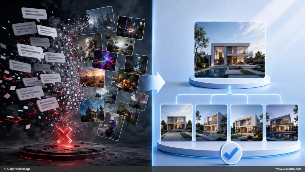
The problem was not that prompts were useless. Prompts are powerful. They are still the control layer of AI image generation. But words alone are a weak foundation for visual precision. Design is not only language. Design is proportion. Lighting. Layout. Depth. Composition. Material. Texture. Cropping. Hierarchy. Spatial logic. Mood. Brand feel. Reference culture.
A sentence can describe these things. But an image can carry them instantly.
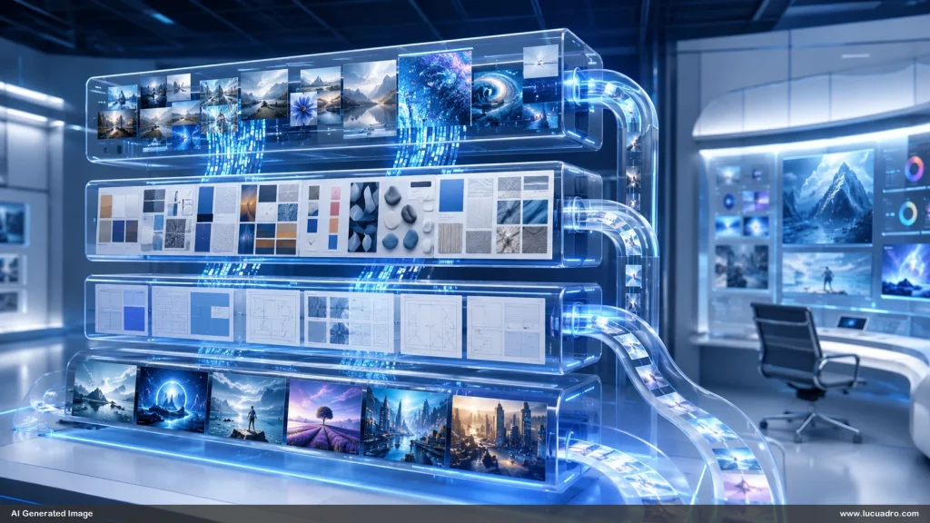
That is why reference images are becoming the new AI image infrastructure.
Not decoration. Not inspiration. Not mood board fluff. Infrastructure.
Reference images are becoming the visual operating system behind serious AI image workflows. They define what prompts cannot reliably define. They create continuity. They preserve style. They guide composition. They reduce randomness. They help teams move from one-off generations to reusable visual systems.
For businesses, designers, marketers, educators, agencies, consultants, and creators, this shift matters.
Because the future of AI image generation will not belong to the person who writes the longest prompt.
It will belong to the person, team, or company with the best visual reference system.
The Prompt Era Was Only the Beginning
The early AI image era trained people to think like prompt engineers.
The game was simple: write better words, get better images.
People built prompt libraries. Prompt marketplaces appeared. Guides taught users how to write in cinematic language. “Ultra realistic.” “Shot on DSLR.” “Volumetric lighting.” “Octane render.” “Editorial photography.” “Minimalist Swiss design.” “3D isometric.” “Luxury corporate style.” “Futuristic blue holographic interface.”
This worked well enough for experimentation.
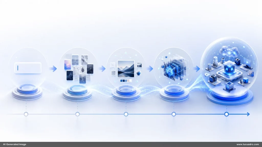
But when people tried to use AI images for real business assets, the limits became obvious.
A company does not need one cool image. It needs 50 images that feel like they belong together.
A presentation designer does not need a random futuristic office background. They need a repeatable visual scene that can hold different diagrams, messages, and layouts.
A visual asset store does not need beautiful accidents. It needs structured outputs that can be searched, reused, extended, and adapted.
A brand team does not need novelty every time. It needs consistency.
This is where prompts start to fail.
Words are flexible, but they are not stable. A prompt can produce ten different outputs with ten different composition logics. The model understands the general concept, but not always the exact visual intention.
Reference images solve this problem.
They anchor the model.
They say: not just “make a business diagram in an office.” They say: “make it like this layout, with this spacing, this object logic, this camera position, this material behavior, this kind of empty area, this level of polish.”
A reference image is not just a picture.
It is a compressed design decision.
Reference Images Turn Taste Into a System
Taste is hard to explain.
A creative director can say, “Make it cleaner.”
A designer can say, “More premium.”
A founder can say, “Less generic.”
A marketer can say, “More direct response, but still modern.”
A trainer can say, “Make it visual, but not childish.”
These are real instructions. But they are not precise enough.
The phrase “premium” can mean Apple-like white minimalism. It can mean luxury black and gold. It can mean editorial fashion. It can mean high-end consulting slides. It can mean cinematic lighting. It can mean sterile enterprise SaaS design.
A reference image collapses the ambiguity.
It shows the taste.
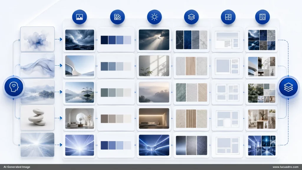
This is why reference images are becoming central to AI creative workflows. They turn subjective preference into visual evidence. Instead of arguing about style, teams can build a shared reference library.
The library becomes the taste layer.
It says:
This is what “premium” means for us.
This is what “business futuristic” means for us.
This is what “clean diagram” means for us.
This is what “photorealistic office scene” means for us.
This is what “holographic but not cheesy” means for us.
This is what “AI visual” means without using robot clichés.
This is what “empty space for text” means.
This is what “integrated into the scenery” means.
Once these references exist, the work changes.
You stop inventing from zero.
You start extending a visual language.
The New Asset Is Not the Image. It Is the Reference System.
Most people still think of AI images as final outputs.
That is too small.
The real asset is the system that produces the outputs.
A single image can be useful once. A reference system can create hundreds of coherent images.
This is the big shift.
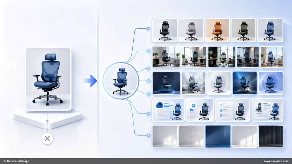
A visual asset store is not just a folder of PNGs. It can become a machine for visual consistency. It can contain reference images for:
Office backgrounds
Slide layouts
Diagram structures
Icon styles
Character poses
Material treatments
Lighting setups
Product mockups
Social ad formats
Infographic compositions
Scene types
Camera angles
White space rules
Brand moods
Presentation frames
Content placeholders
Each reference becomes a reusable seed.
Not a seed in the technical sense. A seed in the creative sense.
It carries a pattern.
A strong reference image can define the structure of future images. It can say: two vertical panels in a futuristic lobby, straight-on camera, glossy floor reflections, blue ambient lighting, plastic board material, no extra content, enough empty space for later text.
That reference can then be adapted into metal, plastic, holographic, wood, glass, fabric, stone, acrylic, matte ceramic, brushed aluminum, translucent blue, or high-gloss black.
The core layout stays. The surface changes.
This is how reference images become infrastructure.
They make AI generation modular.
Why Reference Images Beat Long Prompts
Long prompts often feel powerful because they create the illusion of control.
But a long prompt can also confuse the model.
The more instructions you add, the more likely some will be ignored, blended, or interpreted strangely. A prompt that says “modern office, straight-on, no angle, two plastic boards, exact layout, no extra content, realistic shadows, integrated into scenery, premium, business context, blue holographic background, no graphs, no AI words, no text except numbers” may still produce unwanted details.
Why?
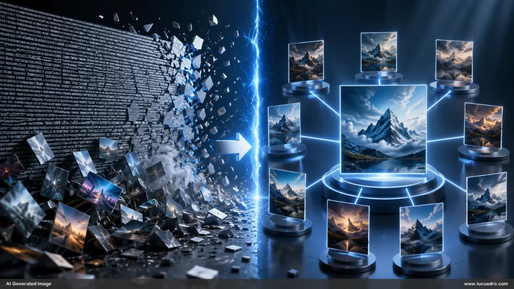
Because language is not layout.
An image is layout.
A reference image tells the model what the spatial relationship should be. It carries position, scale, visual rhythm, proportions, distance, and negative space.
A prompt can say, “leave space between the boxes.”
A reference image shows the exact amount of space.
A prompt can say, “make it front-facing.”
A reference image shows what front-facing means.
A prompt can say, “make the box look integrated.”
A reference image shows how the box sits in the environment.
A prompt can say, “do not add content.”
A reference image shows the blank areas.
In serious workflows, the best results often come from combining both:
The prompt gives direction.
The reference image gives structure.
The prompt says what changes.
The reference image says what must stay.
This is the future of AI image control.
Reference Images Are the Bridge Between Design and Generation
Traditional design workflows are based on intentional construction.
A designer chooses a canvas. Places elements. Adjusts hierarchy. Aligns edges. Creates spacing. Balances visual weight. Tests readability. Exports the asset.
AI image generation works differently.
It creates from probability.
That is why it can be brilliant and unreliable at the same time.
Reference images bridge these two worlds.
They bring design logic into generative systems.
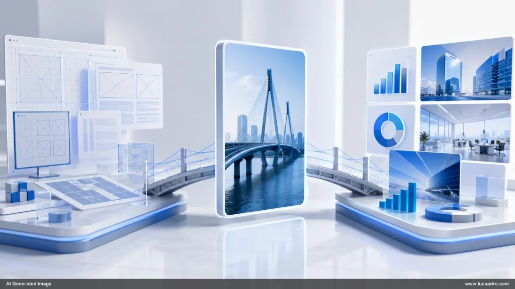
Instead of asking the model to invent everything, you provide a visual scaffold. The model no longer has to decide the entire composition from scratch. It can focus on rendering, texture, lighting, atmosphere, and variation.
This is especially important for business visuals.
Business visuals often need structure more than surprise.
A social ad needs a clear focal point.
A slide background needs empty space.
A comparison graphic needs balanced panels.
A training visual needs legibility.
A product mockup needs plausible geometry.
A presentation asset needs hierarchy.
A website hero image needs controlled composition.
Without reference images, AI tends to over-create.
It adds extra screens. Fake text. Random charts. Decorative noise. Confusing UI elements. Stray logos. Unwanted symbols. Awkward objects. Overly dramatic lighting. Busy backgrounds.
A good reference image tells the model to calm down.
It defines the container.
That container is what makes AI images usable in real design systems.
The Rise of the Reference Image Library
The next generation of creative teams will not only maintain brand guidelines.
They will maintain reference image libraries.
A brand guideline tells humans what the brand should look like.
A reference image library tells AI what the brand should generate.
That is a major difference.
Old brand guidelines were made for designers, agencies, and vendors. They included colors, typography, logo rules, spacing, photography direction, tone of voice, iconography, and example layouts.
But AI systems need something more visual and more operational.
They need examples.
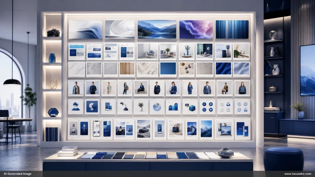
A strong reference image library could include categories like:
“Executive presentation scenes”
“Minimal white office diagrams”
“Blue holographic business backgrounds”
“Abstract strategy visuals”
“Premium plastic boards”
“Glassmorphism UI panels”
“Warm human training scenes”
“Isometric business systems”
“Clean social media ad layouts”
“Photorealistic object placeholders”
“Empty-space hero images”
“Consulting framework compositions”
“Before-after comparison structures”
“Process flow image templates”
These are not merely images to publish.
They are images to generate from.
The library becomes a creative engine.
A designer can choose a reference and say: make this in a warmer office, with three panels, wood texture, no text, more depth. A marketer can choose a reference and say: make this as a LinkedIn ad background, with more contrast and space in the center. A trainer can choose a reference and say: make this as a course module visual, less futuristic, more human, still clean.
The reference library makes the workflow faster.
It also makes it less dependent on one person’s prompting skill.
That matters for teams.
Reference Images Make AI More Brand-Safe
AI image generation has a consistency problem.
Brands have a consistency requirement.
This tension is where reference images become valuable.
Without references, every generation can drift. The same prompt may produce different materials, camera styles, levels of realism, object shapes, lighting conditions, and visual moods.
For casual use, that is fine.
For brand use, it is expensive.
Every inconsistent image creates editing work. Every off-brand image weakens trust. Every random style shift makes the company look less professional.
Reference images reduce drift.
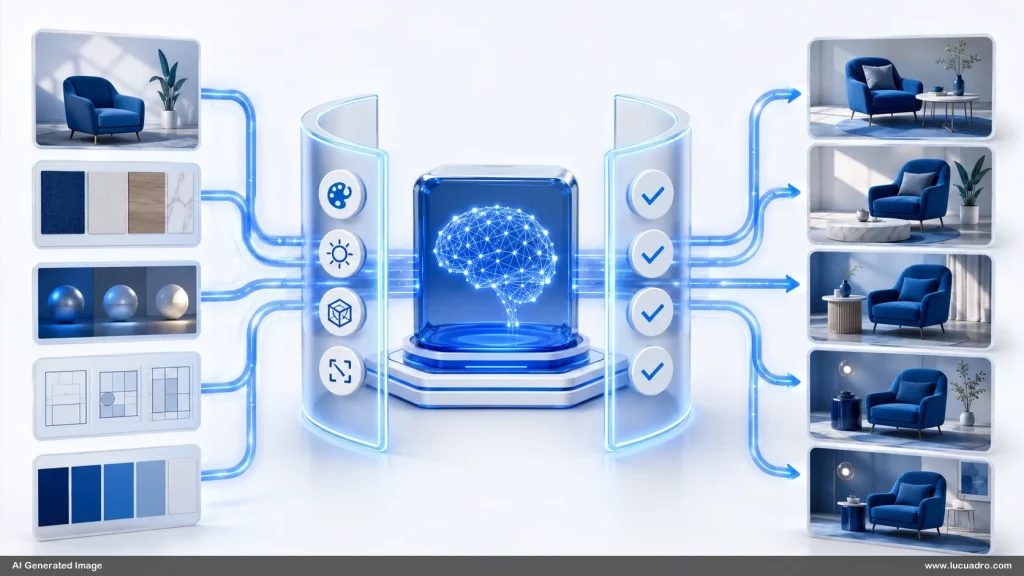
They do not guarantee perfect consistency. But they provide a visual anchor. They help preserve recurring traits:
Color mood
Surface quality
Lighting direction
Composition style
Object type
Camera distance
Background logic
Level of realism
Spacing habits
Business tone
Visual hierarchy
A company that uses AI without reference images is basically gambling with its visual identity.
A company that builds a reference image infrastructure can create controlled variation.
That is the real power.
Not sameness. Controlled variation.
A brand should not publish the exact same image forever. But it should feel like the same world. The same intelligence. The same taste. The same visual standard.
Reference images help create that world.
The Future Is Visual Prompting, Not Text Prompting Alone
The phrase “prompt engineering” made sense in the early phase.
But the next phase is visual prompting.
Visual prompting means giving the AI model not only words, but visual context.
A sketch can be a prompt.
A screenshot can be a prompt.
A wireframe can be a prompt.
A photo can be a prompt.
A layout can be a prompt.
A mood board can be a prompt.
A previous generation can be a prompt.
A 3D render can be a prompt.
A rough diagram can be a prompt.
A brand asset can be a prompt.
This is a more natural way to work.

Humans have always created visually through references. Art directors bring mood boards. Designers collect screenshots. Architects study precedents. Photographers use lighting references. Filmmakers use storyboards. Advertisers use swipe files. Product designers use UI references.
AI is not replacing that.
AI is making it more important.
The better your reference input, the better your generative output.
The old question was: “What prompt should I write?”
The new question is: “What visual evidence should I give the model?”
That is a deeper question.
It forces you to clarify what you actually want.
Why This Matters for Visual Asset Stores
For a visual asset store, reference images may become more valuable than finished images.
That sounds strange at first.
But think about the economics.
A finished image solves one use case.
A reference image can create many use cases.
A customer may buy a single image for a slide. Useful. But a customer who gets a reference system can generate variations for an entire deck, campaign, course, or brand world.
That is a much stronger value proposition.
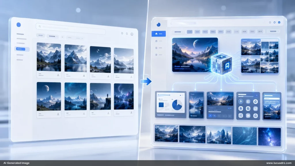
A visual asset store can move beyond selling static assets and start selling reusable visual logic.
For example:
A pack of 50 “AI office backgrounds” is useful.
But a pack of 50 AI office background reference systems is more powerful. Each includes the base image, layout rules, material variations, aspect ratio suggestions, negative prompt guidance, and sample use cases.
A pack of “business icons” is useful.
But a pack of icon style references that can generate thousands of consistent icons is more powerful.
A pack of “presentation layouts” is useful.
But a reference library for modular slide scenes, placeholder panels, and integrated business objects is more powerful.
This changes what a visual asset store can be.
It can become a creative infrastructure company.
Not just a download shop.
Reference Images Create Reusable Visual Grammar
Every strong visual system has grammar.
In language, grammar defines how words fit together.
In visuals, grammar defines how shapes, spaces, colors, materials, and compositions behave together.
A reference image captures visual grammar.
For example, a business slide reference may encode:
Header at top
Large empty body area
Two side-by-side content zones
Dark navy label area
Light blue writing area
Thin border
Straight-on view
Generous white space
No decorative clutter
Corporate realism
Cool lighting
Reflective floor
Objects centered in space
Once that grammar exists, you can create variations without losing the underlying logic.
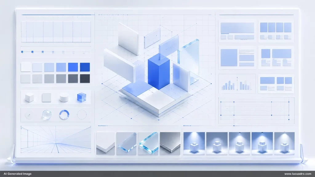
Two boxes become three.
Plastic becomes metal.
A flat panel becomes a 3D object.
A wall mount becomes a hanging sign.
A board becomes a kiosk.
A diagram becomes an installation.
A template becomes a scene.
The grammar remains.
That is what makes reference images so useful.
They allow variation without chaos.
This is exactly what businesses need. They need many outputs that feel related but not repetitive.
Reference images allow that balance.
The Hidden Value of Empty Space
One of the most underrated parts of AI image generation is empty space.
AI models often want to fill everything.
But business design often needs room.
Room for text.
Room for product screenshots.
Room for diagrams.
Room for headlines.
Room for annotations.
Room for later editing.
Room for the viewer to breathe.
A reference image can preserve empty space better than a text prompt.
When the reference shows blank panels, open walls, clear floors, or large quiet areas, the model understands that the emptiness is intentional.
This is critical for visual asset stores.

Most stock images are finished compositions. They are not designed as editable business canvases. They often have clutter exactly where the user needs space. They may look good, but they are hard to use.
AI-generated reference-based assets can be different.
They can be designed as containers.
A container image is not just beautiful. It is useful.
It gives the user a place to put meaning.
This is where the market is going.
The best AI business visuals will not be the busiest images. They will be the most usable images.
Reference images help create that usability.
Why “Integrated Into the Scene” Is the New Quality Standard
A major weakness of low-quality AI business visuals is that objects feel pasted on.
A board appears in an office, but it does not belong there.
A screen floats without physical logic.
A hologram glows without casting light.
A panel has no thickness.
A diagram ignores perspective.
A sign has no mounting system.
A product display has no shadow.
A whiteboard appears too clean, too flat, too digital.
The eye notices.
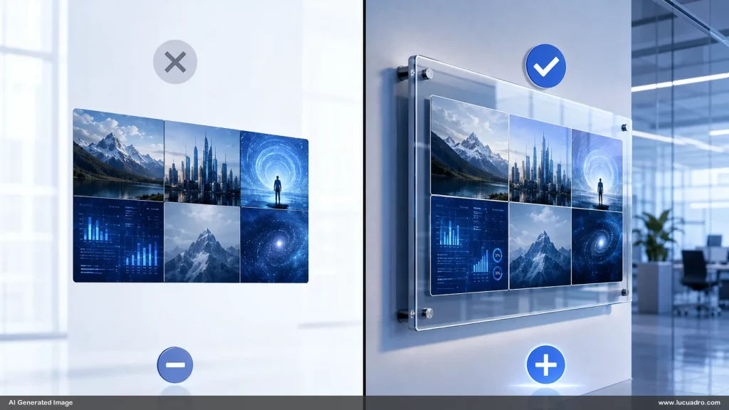
Even when the viewer cannot explain the problem, the image feels cheap.
Reference images can improve this by showing real integration cues:
Contact shadows
Reflections
Mounting systems
Stands
Ceiling cables
Wall brackets
Wheels
Floor bases
Transparent edges
Light spill
Material thickness
Environmental reflections
Scale relationships
These details matter.
They are what turn a flat graphic into a believable scene.
For thought leadership, this is key: AI images are moving from “generated picture” to “spatial design.”
The image must not just show an object.
It must show how the object lives in the world.
Reference images are the best way to teach that world logic.
The Coming Split: Prompt Libraries vs Reference Libraries
Prompt libraries were the first wave.
Reference libraries will be the next.
Prompt libraries are easy to create. They are also easy to copy. A prompt can be shared, rewritten, or extracted. It rarely provides durable advantage by itself.
Reference libraries are different.
They are harder to build well.
They require taste, testing, organization, and visual strategy. They require knowing what kinds of references actually produce useful outputs. They require understanding where AI models follow references well and where they drift. They require curation.
A good reference library is not a dump of random images.
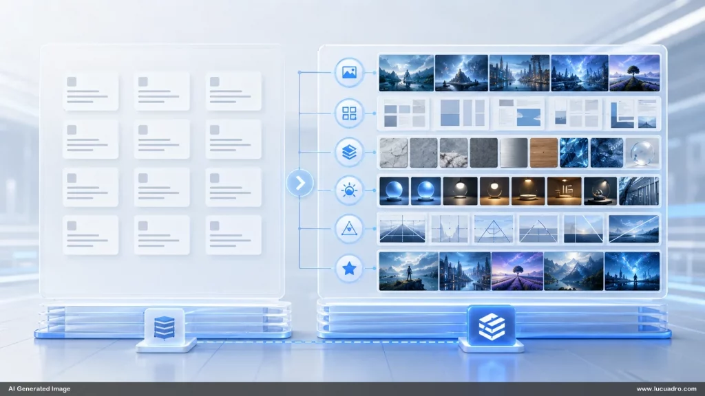
It is a structured creative asset.
It might include:
Base layout references
Style references
Material references
Lighting references
Scene references
Composition references
Camera references
Object references
Negative examples
Approved examples
Variation trees
Use-case folders
This is more defensible than a prompt list.
The prompt tells the model what to do.
The reference library shows the model what world to stay inside.
That is harder to imitate.
For visual asset businesses, this is a strategic opportunity.
The market is still early. Most people are selling outputs. Few are building infrastructure.
Reference Images Help Humans Collaborate With AI
AI image generation is often framed as a solo workflow.
One person. One prompt. One model.
But business creativity is collaborative.
A founder has a vision.
A designer has standards.
A marketer has performance goals.
A trainer has clarity needs.
A salesperson has customer context.
A brand manager has consistency concerns.
A content team has deadlines.
Reference images give these people a shared object.
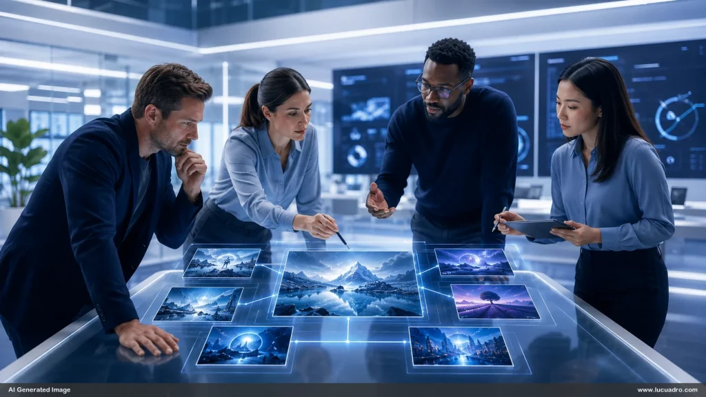
They can point to the same image and say what should stay and what should change.
“Keep this layout.”
“Make the material more premium.”
“Less futuristic.”
“More office, less sci-fi.”
“Keep the empty middle.”
“Same angle, different background.”
“Same background, different display system.”
“Make the boards feel physical.”
“Remove fake charts.”
“Use this as the composition reference, not the style reference.”
This is practical.
It reduces the gap between intention and output.
In a team setting, reference images become a coordination tool.
They are not only AI inputs. They are communication assets.
The Best Reference Images Are Designed, Not Found
Many people think a reference image is something you search for online.
That can work.
But the best reference images are often custom-made.
Why?
Because public references rarely match the exact business use case. They may have the wrong aspect ratio, too much detail, bad spacing, awkward text, poor composition, strange lighting, or legal usage concerns.
A designed reference image is different.
It is created with future generation in mind.

That means it has:
Clear composition
Strong silhouette
Controlled spacing
Minimal noise
Useful empty areas
Defined material logic
Consistent perspective
No unwanted text
No brand conflicts
A reusable structure
A clear purpose
This is a new design discipline.
Designing images not only for human viewing, but for AI reuse.
That is why reference images are infrastructure.
They are upstream assets.
They influence many downstream outputs.
A visual asset store that understands this can create reference images intentionally. Not just pretty images. Images that generate well.
The Reference Image as a Strategic Moat
In business, a moat is something that protects advantage.
For AI image workflows, reference libraries can become a moat.
Not because nobody else can generate images. Everyone can.
The advantage comes from knowing what to generate from.
A company with a strong reference library can produce better images faster. It can maintain visual consistency across campaigns. It can train new team members more easily. It can reduce design bottlenecks. It can create brand-safe AI outputs. It can repurpose scenes across formats. It can scale content production without collapsing into generic visuals.
That is a real advantage.
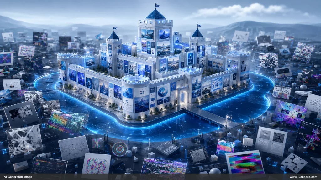
The same will apply to creators and asset stores.
Anyone can write “modern corporate AI office with holographic panels.”
But not everyone has a tested library of references that reliably produces useful business scenes.
The moat is not the sentence.
The moat is the system.
What Makes a Good AI Reference Image?
A good reference image is not always the most beautiful image.
It is the image that gives the model the clearest useful signal.
The best reference images usually have several traits.
They have strong structure. The model should understand the layout quickly.
They have controlled complexity. Enough detail to establish realism, but not so much that the output becomes cluttered.
They have clear hierarchy. The main elements are obvious.
They have consistent lighting. The model can reuse the atmosphere.
They have useful negative space. The output can be edited later.
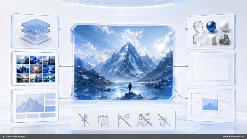
They have material clarity. Plastic looks like plastic. Glass looks like glass. Metal looks like metal. Wood looks like wood.
They avoid accidental details. Random text, logos, screens, numbers, charts, and decorative symbols can get copied or mutated.
They are close to the intended use case. A reference for a business slide background should not look like a movie poster.
They are scalable. The idea can produce variations.
This last point matters most.
A good reference image should not be a dead end.
It should be a starting point.
The Future Workflow: Reference First, Prompt Second
The old workflow:
Write prompt.
Generate image.
Hope.
Revise prompt.
Generate again.
Hope again.
The new workflow:
Choose reference.
Define what must stay.
Define what must change.
Generate controlled variations.
Curate the best outputs.
Add them back into the reference library.
Build a stronger system over time.
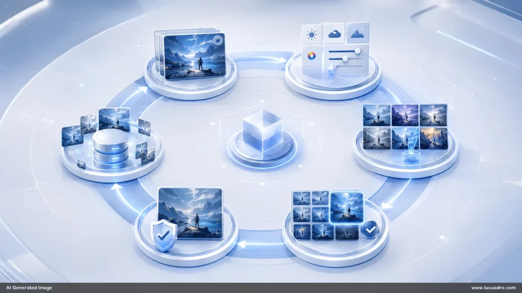
This creates a compounding loop.
Every good output can become a future reference.
The library improves.
The team learns.
The visual language sharpens.
The asset store becomes more valuable.
This is how AI image generation becomes a production system instead of a slot machine.
Reference images are the difference between accidental creativity and repeatable creativity.
Why This Is Bigger Than AI Art
The phrase “AI image generation” still makes many people think of fantasy art, concept art, portraits, or viral social media images.
But the bigger market may be business visuals.
Business needs endless visual material:
Presentation backgrounds
Training visuals
Website hero images
Blog thumbnails
Social media graphics
Explainer scenes
Course modules
Sales pages
Ad creatives
Pitch decks
Internal documents
Product visuals
Framework diagrams
Process graphics
Event visuals
Newsletter graphics
Lead magnet covers
Most of this does not need “art.”
It needs clarity, consistency, and speed.
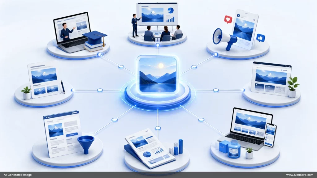
Reference images are perfect for this.
They let teams create business-ready visuals without starting from zero every time.
They also help avoid the generic AI look.
That matters.
As AI-generated content increases, generic visuals will become invisible. People will recognize the same neon circuits, glowing robots, floating dashboards, and fake futuristic screens. The market will punish lazy AI visuals.
Reference-based visual systems can create more specific worlds.
A brand can look like itself.
A store can develop recognizable asset categories.
A creator can build a signature look.
That is where value moves.
Reference Images Will Change SEO and Content Marketing Too
SEO is not only text anymore.
Search experiences are becoming more visual. Content is judged not only by keywords, but by usefulness, engagement, trust, and presentation quality.
Articles with strong original visuals feel more authoritative. Landing pages with custom images feel more valuable. Blog thumbnails influence clicks. Social previews affect distribution. Visual examples improve time on page. Diagrams increase comprehension.
Reference images help scale this.
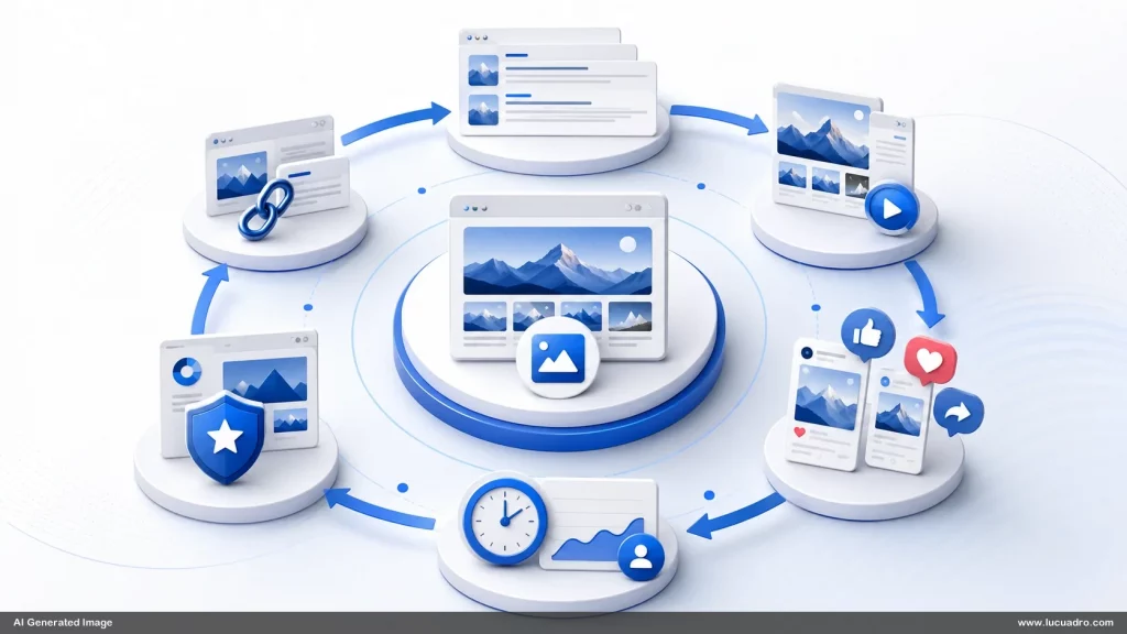
A visual asset store can create consistent article visuals for entire topic clusters. For example:
AI image generation
Presentation design
Visual communication
Prompt engineering
Business storytelling
Slide templates
Marketing assets
Corporate training
Brand systems
Content creation
Each cluster can have its own reference style.
The result is not just better images.
It is stronger topical identity.
When someone lands on the site, the visuals feel intentional. The brand feels bigger. The content feels more owned.
This is an SEO advantage because good visual systems make content more memorable, more linkable, and more shareable.
Words bring the search traffic.
Visuals build the trust.
The Visual Asset Store of the Future
The future visual asset store may not look like today’s stock image marketplace.
It may be closer to a visual operating system.
Users will not only download images. They will download systems.
A future asset product might include:
Reference images
Editable templates
Prompt recipes
Style variations
Material variations
Aspect ratio versions
Scene variations
Transparent PNG elements
Background-only versions
Placeholder versions
Before-after examples
Usage instructions
Brand adaptation tips
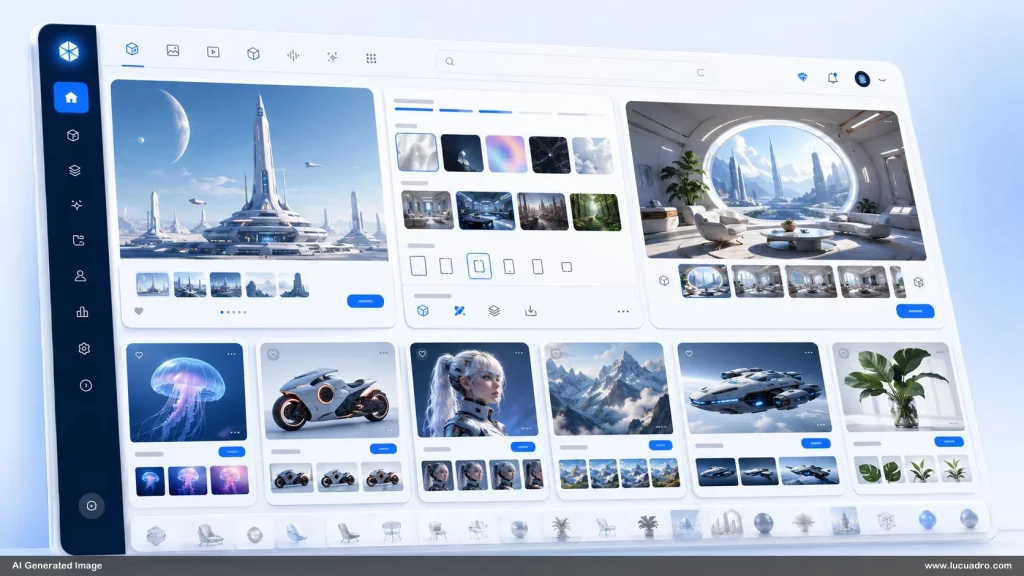
The customer will not think, “I bought an image.”
They will think, “I bought a visual workflow.”
That is much more valuable.
Reference images are the core of that workflow.
They are the bridge between static assets and generative production.
This creates a major opportunity for visual asset stores.
Instead of competing with free AI image tools, they can provide what those tools do not provide by default:
Taste.
Structure.
Consistency.
Usability.
Business relevance.
Reusable visual logic.
That is the product.
Reference Images Are the New Creative Infrastructure
Infrastructure is usually invisible.
Roads. Power grids. Servers. APIs. Databases. Design systems. Brand systems.
You notice infrastructure most when it is missing.
The same is true in AI image generation.
Without reference infrastructure, every image is a fresh struggle. Every prompt starts from zero. Every output drifts. Every campaign has a different look. Every deck feels patched together. Every designer has to clean up the chaos.
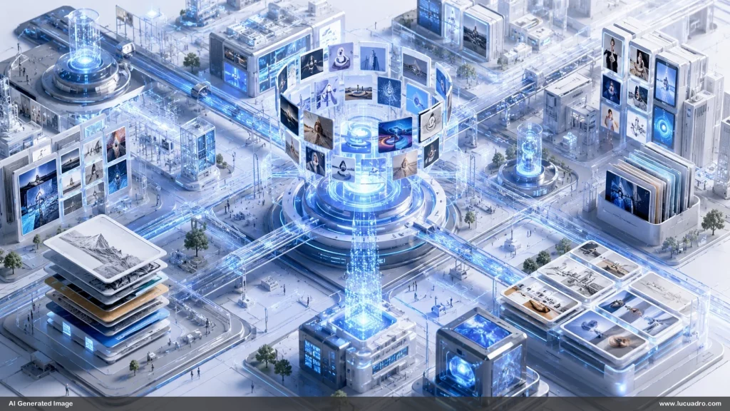
With reference infrastructure, the work becomes easier.
You have places to start.
You have visual rules.
You have tested patterns.
You have reusable scenes.
You have consistency.
You have speed.
You have a shared language.
This does not remove creativity.
It protects creativity from waste.
The best creative systems do not trap people. They remove low-value decisions so people can focus on higher-value decisions.
Reference images do exactly that.
They remove the need to re-explain the same visual logic again and again.
Conclusion: The Next Advantage Is Visual Control
AI image generation has made image creation abundant.
But abundance creates a new problem.
When anyone can generate images, the value shifts from generation to control.
Who can create the right image?
Who can create it consistently?
Who can adapt it quickly?
Who can make it brand-safe?
Who can make it useful in a real business context?
Who can build a visual world instead of isolated visuals?
Reference images answer these questions.
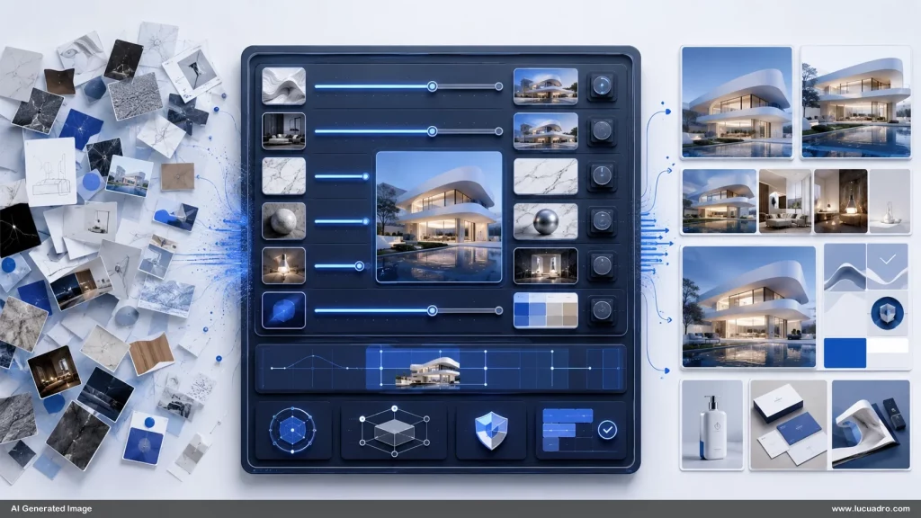
They are becoming the new AI image infrastructure because they give shape to generative creativity. They turn taste into a system. They turn prompts into workflows. They turn one-off outputs into reusable visual languages.
For brands, they are a consistency tool.
For designers, they are a control layer.
For marketers, they are a speed advantage.
For educators, they are a clarity engine.
For visual asset stores, they are a new product category.
The future will not be prompt-only.
The future will be reference-driven.
The companies and creators who understand this early will build better libraries, better workflows, and better visual systems.
The image is no longer just the output.
The image is the infrastructure.